AI + Computing Tools for Design
By Knut M. Synstad
April 30, 2020
As a 2020 Latham fellow, Knut shared his emerging ideas on ID’s 2020 Latham theme, data and design, by giving a lecture and participating in a question-and-answer session (moderated by ID faculty member John Cain), as well as publishing the following freely available digital content.
Much of what designers do involves looking at how artifacts or features fit in and stand out. That is, designers are often concerned with similarity and difference—seeing them, understanding them, classifying them, and manipulating them. For example, a new icon must fit into a system and also be distinct from it.
A common step in developing products and identity systems is to collect examples from competitors and discuss them with clients. Today, software can speed up the process, while also enabling inclusion of much larger data sets.
The following example of software development by and for designers—beyond image editing—shows how changes in computing will continue to accelerate changes in design practice.
These changes have significant implications for design education and continuing education. For example, it seems clear that designers will need to become comfortable using statistical and computational methods to find patterns and to display relationships.
In this experiment, I leveraged AI techniques to algorithmically organize the logos of the Fortune 500 by visual similarity. A task that would be both difficult and time-consuming to do by hand, the computer does with ease. The result is a truly interactive visualization, where the parameters of underlying algorithms have been exposed—enabling viewers to interact with and manipulate the outcome.
In a nutshell, it’s about teaching the computer to see and process patterns.
The larger context
Our own ability to see and process patterns has been essential to our success and survival as a species. The evolution of neural networks in the outer layer of our brains has enabled us to process visual and auditory patterns, helping us separate prey from a predator, helpful from harmful, good from bad. In fact, these natural neural networks are so efficient that we’re trying to mimic them with software. However, as the networks grow, so does the time and cost of running them.
Late MIT professor Patrick Henry Winston called computing power “the most important enabler of deep learning [a type of layered neural network.]” Historically, both cost and access to high-performance computing limited their usefulness. But now, with the marginal cost of computing dropping to near zero, nearly everyone can access “affordable” on-demand computing.
Broadened access to high-performance computing has accelerated advancements in AI, but even the largest networks can’t match the size or complexity of the human brain—yet. That said, artificial neural networks are still able to outperform us on many tasks. To understand where to effectively apply them we must study our own cognitive limitations, so that we can develop solutions that persist where we fall short.
In his 1956 paper, “The Magical Number Seven, Plus or Minus Two: Some Limits on Our Capacity for Processing Information,” cognitive psychologist George A. Miller asserted that an average person can hold 7 ± 2 pieces of information in their working memory (both immediate memory and absolute judgment) at any given time. His assertion affects our daily life in more ways than you might realize. Ever wonder why US phone numbers and license plates are limited to 7 characters in length?
Our cognitive limitations make it difficult for us to process large amounts of information. To hold 7 Boolean values, a simple form of information, representing either a true or false statement, the computer needs 7 bits. Contrast this with the up to 32 gigabytes or 256,000,000,000 bits of memory on a 2020 MacBook Pro and the computer’s advantage is clear. Cloud-based systems may have orders of magnitude more memory.
My approach
This experiment takes advantage of computers’ superior working memory and processing speed. The visualization is the result of millions of calculations, and most are calculated live in your browser. Doing the calculations in real time enables us to expose the parameters of the underlying algorithms—so that we can interact with and manipulate what Herbert Simon might call ‘the space of logos.’
The visualization is the outcome of a series of data transformations:
- Data wrangling
- Feature detection
- Feature selection
- Distance matrix
- Dimensionality reduction
- Linear assignment
- Data visualization
1. Data wrangling
Creating a good dataset takes a lot of time and patience. In 2014, The New York Times estimated that up to 80 percent of a data scientist’s time is spent collecting and preparing data.
To get started we simply needed a list of the companies on the Fortune 500 list. Thankfully Fortune magazine’s robots.txt permits crawling their website for this information, providing the full list and some metadata for each company.
Collecting the logos took surprisingly long and required a lot of legwork. Striving for consistency, it seemed like a good idea to collect vector versions for all, even though it slowed down the process significantly. Coming from a wide variety of sources, and a wide variety of file formats, it quickly became clear that they needed to be processed, cleaned, and saved in a uniform manner (SVG).
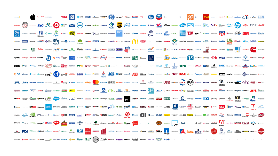
Fig 1: The logos of the Fortune 500, by rank
Using a NodeJS-powered headless browser (PhantomJS), the vector logos were rendered and exported as bitmap PNGs, scaled to fit and centered in a 1024 pixel square with a transparent background.
2. Feature detection
After collecting the logos they needed to be quantified or measured. What do they look like? What colors are being used? If a designer was to do this by hand, they might make note of several features such as typography, shape, composition, and color. It’s a time-consuming effort that relies on making subjective decisions that are prone to mistakes and difficult to codify and scale.
In his 2008 book Predictably Irrational, Dan Ariely, professor of psychology and behavioral economics at Duke University asserts: “Humans rarely choose things in absolute terms. We don’t have an internal value meter that tells us how much things are worth. Rather, we focus on the relative advantage of one thing over another, and estimate value accordingly.”
It is more likely that a designer would describe a logo’s features by assigning labels than a numeric value. For example, Walmart has a sans serif typeface while Berkshire Hathaway has a serif typeface. Target’s logo is a circle, while Wells Fargo is a square. One’s familiarity with a domain is proportional to one’s ability to describe objects within it.
Unlike humans, the computer is more than happy to assign a value. Using a neural network to describe the logos not only provides a list of features, but also enumerates to what degree a feature is present or absent. Ensuring a consistent list of features for all logos lets us compare apples with apples. A pre-trained general-purpose image classification network, ResNet50, was used for this process. Developed by a team of Microsoft researchers, this 50-layer Residual Network won the 2015 ImageNet image classification competition (ILSRVS 2015).
For each logo, the neural network generated 2048 values, each representing the presence or absence of a particular feature. Together, these features granularly describe the shape of a logo. For a moment, let’s imagine that we are trying to describe a person. A feature we might describe them by is height. By measuring their height, we get a value. There is a 1 to 1 relationship between features, or a dimension to describe something by, and the value or measurement we get.
This is how the neural network described the shape of the Walmart logo:
0.01971 0.07665 0.10508 0.00000 0.00510 0.48769 0.00000 0.08663 0.09032 0.01971 0.07665 0.10508 0.00000 0.00510 0.48769 0.00000 0.08663 0.09032 0.01971 0.07665 0.10508 0.00000 0.00510 0.48769 0.00000 0.08663 0.09032 …
When you see this output, it’s easy to understand why many hold the misconception that neural networks are black boxes, with little to no insight into what, how, and why they do what they do. Of course, this is simply not true. A complicating factor is that what the computer thinks a feature is might not be what our designer believes to be a feature. Of course, the neural network doesn’t know our semantic structure and cannot recreate it out of the box. Instead, view these features as “feature fragments”, where multiple features are required to form what a human designer would consider a feature, (e.g., what humans see as a square. The computer sees a collection of edges and corners. It doesn’t know that when combined, these features form a square.)
In addition to shape, it’s interesting to look at the usage of color. For each logo, the two most prominent colors were identified using K-means clustering and then separated by color channel (RGB). Producing 6 additional features to describe the logos by.
Here are the values for the color features of the Walmart logo:
-0.00000 124.86442 197.96974 255.00000 194.16913 31.88876
By combining the shape and colors features, we end up with 2054 features for each logo.
3. Feature selection
Not all features the neural network was trained to spot are relevant for this data set—many are simply noise. Through a statistical procedure called principal component analysis, the features representing shape were boiled down from 2048 to the 50 most relevant ones.
A total of 50 shape features and 6 color features formed the basis for our visualization.
4. Distance matrix
A list of enumerated features for all logos enables us to calculate the pairwise distance between all pairs. Imagine plotting two logos in a multidimensional chart (one dimension per feature) and drawing a straight line between the two. This line represents the Euclidean distance between the two, a measurement of their similarity or dissimilarity.
By iterating over all logo pairs, we create a matrix of distances between any two logos.
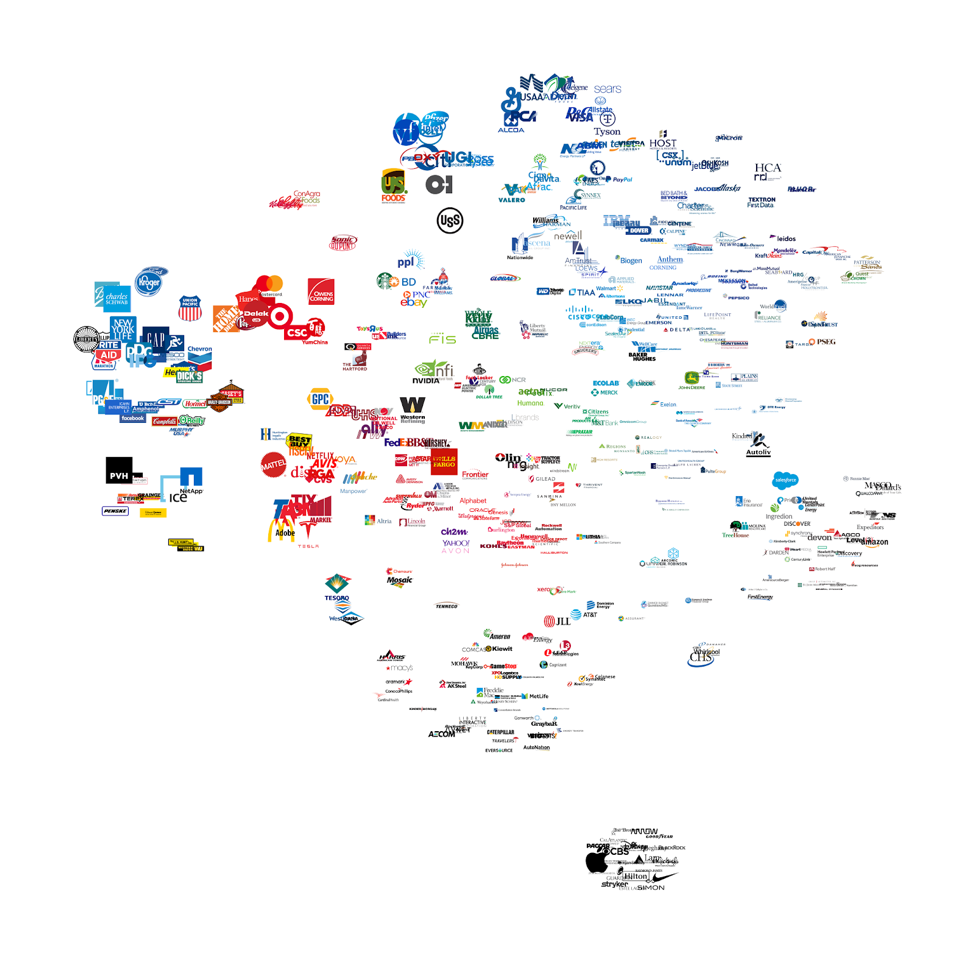
Fig. 2: Output of the t-SNE process
5. Dimensionality reduction
Since its creation in 2008, Geoffrey Hinton and Laurens van der Maaten’s award-winning t-Distributed Stochastic Neighbor Embedding (t-SNE) algorithm has become incredibly popular. Ideal for creating compelling two-dimensional images of large datasets, the authors have applied it to datasets with up to 30 million nodes.
It takes a multi-dimensional distance matrix as an input and attempts to plot the data onto a two-dimensional surface while trying to respect the distance between each pair. The solution is incremental and improves with every call of its step function. Adding steps increases the calculation time linearly. The number of steps required to reach a stable structure varies.
From the t-SNE algorithm, we get a point cloud with x and y values for each logo—ready for plotting. This makes it possible to identify patterns of logos sharing one or more features.
The JavaScript implementation of the algorithm was developed by Andrej Karpathy.
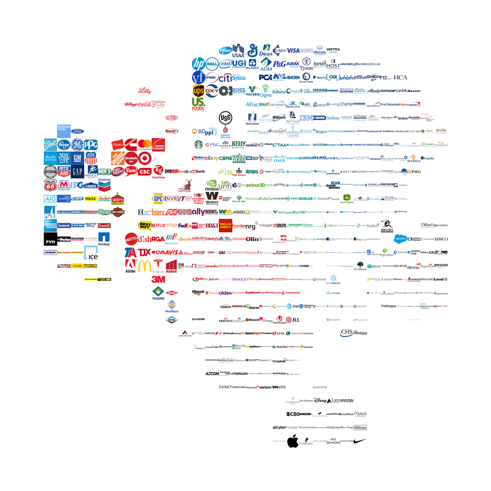
Fig. 3: Output from the linear assignment process
6. Linear assignment
The point cloud output of the t-SNE algorithm does not take object size into account for plotting. Similar objects are likely to overlap as there is no collision detection.
For this reason, the t-SNE algorithm is often paired with an algorithm that aligns the dataset to a grid. A linear assignment algorithm calculates the distance (cost) between each logo and every cell in the grid. Then it assigns one logo per cell, to achieve the lowest overall cost—minimum distortion of the original point cloud.
The JavaScript implementation of R. Jonker and A. Volgenant’s Linear Assignment Problem algorithm (LAP-JV) was developed by Philippe Rivière.
7. Data visualization
The final transformation involves plotting the logos in an interactive visualization with D3.js. In addition to zoom and pan, the visualization dynamically updates as the viewer tunes the parameters of the underlying algorithms.
By default, JavaScript applications are single-thread applications. While running complex calculations, the view may freeze, or even crash—leading to a less than desirable user experience. To avoid this, I employed two web workers to move the bulk of the calculations to two separate CPU threads, enabling the main thread to run uninterrupted.
Conclusion
Even though this subject matter is inherently visual, the approach can be applied to anything, as long as it can be measured and quantified.
I hope you enjoy the experiment. Feel free to reach out with comments, suggestions, and feedback. The source code is available, enabling others to replicate the process, apply it to their own data sets (other sets of symbols), or to extend it to other uses.
Knut Synstad is an award-winning designer who codes. He is a Norwegian expat living and working in San Francisco. Before his career in design, he studied electronics and served as a sub-lieutenant, maintaining electronic weaponry, sensors, and communications equipment for the Royal Norwegian Navy. He did a six-month deployment in the Mediterranean sea as part of the NATO fleet following 9/11.
An interest in technical systems led him to Dubberly Design Office, where he designs products, services, and systems for Fortune 500 companies and start-ups—from a search engine for life science to applications for large-scale planetary analysis. Intrigued by the potential of AI, machine learning, and computing in design, Knut creates experiments to better understand how these techniques may rewrite the design process.
Knut graduated from London Metropolitan University with a BFA in graphic design and earned an MFA in graphic design from the Academy of Art University in San Francisco.