Project
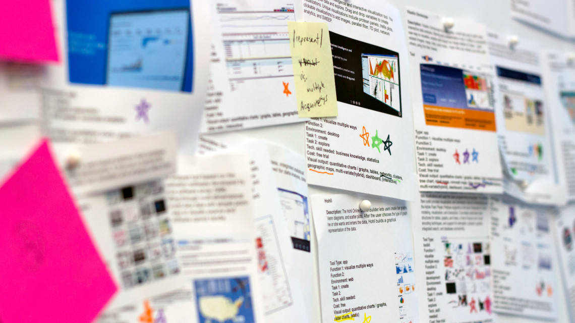
Data is all around us and as designers and researchers, we strive to make sense of it and communicate findings through visualizations. In design research, data analysis can play an important role, along with other inputs–ethnography, interviews, secondary research, competitive analysis, etc.–to assist designers to better understand the context into which they are designing to make more informed choices. Data–both quantitative and qualitative–both requires analysis. Rather than staring at spreadsheets of numbers or a sea of photographs, we wanted to know what kind of visualization tools exist that could aid non-coders to visually access more quickly any insights the data may contain. How user friendly is the tool? What type of data do we need? How many forms of output can we create? This summer, we asked ourselves these questions as we investigated the nature of existing data visualization tools.
Synopsis
- There’s no such thing as a “free” tool.
- After exploring some free tools, as well as paid tools with free trials, we found that free tools required more time investment, compatibility issues, and less user support.
- So what? Users beware. Free data visualization tools are initally appealing, but usually require a greater time investment than paid tools. Free tools also don’t have the same level of support as other paid options.
- Specialized tools have evolved from specific fields and reappropriated for
different, non-original uses.
- In the spirit experimentation, users outside of these specified fields are using these specialized tools for their particular needs.
- So what? Identify the tool’s original intent and evaluate its’ appropriateness for your specific use.
- The definition of “tools” is wide and varied.
- Tools can be anything from code to apps, plug-ins or services.
- So what? You need to understand your own use context, including your environment and skill level. You should also know the technical capabilities of the tool.
- You can evaluate tools by multiple dimensions.
- Tools can be sorted by aesthetic, user task requirements, usability, level of customization, number of functions, compatibility level, types of data input, etc.
- So what? Know what’s important to you when searching for a tool to use.
- There’s a wide range of skills needed to use tools.
- Some tools only require basic knowledge of quantitative measures, while others require in-depth programming knowledge.
- So what? Know your own skill level and whether or not you have the time and/or willingness to learn a new skill.
- Quantitative tools dominate the world of data visualization.
- This isn’t much of a surprise, but it matters to designers who collect qualitative data from users.
- So what? There’s an opportunity to develop tools that better combine qualitative and quantitative data.
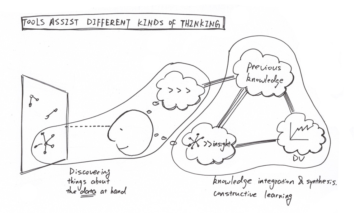
- Few tools support the entire data visualization development process.
- While mapping tools along this continuum, we realized that the majority of them belonged in the ‘represent’ phase.
- So what? There’s a burden on users to collect their own suite of tools that aid them throughout the whole data visualization process.
- Process can be as important as output.
- As we collected and analyzed our data, we continuously learned and re-framed our thinking along the way.
- So what? The act of using the tool can force you to understand your data better. You re-examine assumptions and re-evaluate the relationship between your data.
- Tools allow for a combination of outputs for richer interpretations
- Many of the tools we discovered allowed simultaneous views of data.
- So what? Users can discover through new data combinations and users should suspend jumping to conclusions.
- Tools vary in the way they generate patterns.
- Tools generate patterns by:
- allowing the user to adjust visual variables (e.g. modify colors, scale)
- revealing the pattern (e.g. scatterplots can show outliers)
- requiring user knowledge to refine data to reveal patterns (e.g. applying mathematical formulas)
- So what? Know what you want to do with a pattern. Do you already know the pattern or are you looking for one?
Proposed User Experience
Further Exploration
Activities Focused on the Current Collection
- Develop a list of analytical activities (e.g. frequency counts, comparisons, combination with other data) a designer can ask about a dataset to generate insights.
- Conduct more in-depth interviews with design practitioners to better understand how tools are used in specific design contexts, e.g. design research
Exploring Within a Design Context
- Identify gaps of existing tools and user needs to assist further tool development.
- Validate user scenario models with primary research.
Focused Understanding
- Conduct targeted research within output types to understand the latest thinking and best practices.
- Conduct targeted research with qualitative researchers – new forms of expression for non-traditional data inputs
Broadening Our Understanding
- Make on-going updates to the tool list as the the landscape of data visualization tools changes.
- Research the connection between visualization and interpretation, e.g. factors to understand whether or not a visual is effective.
- Search for tools and speak with non-design professionals to gather data on a broader range of tools.
Add to our collection
Do you know of a tool that isn’t listed in our research?
Click here to send us a recommendation and share details about why we should explore this particular tool. We know that new tools are being created to help designers, researchers, and other professionals better understand and visualize your data. So in the spirit of the continuous iteration, we welcome all suggestions!