Though we often use numbers to express results, they can be very limited in their ability to relate a fuller story and build empathy.
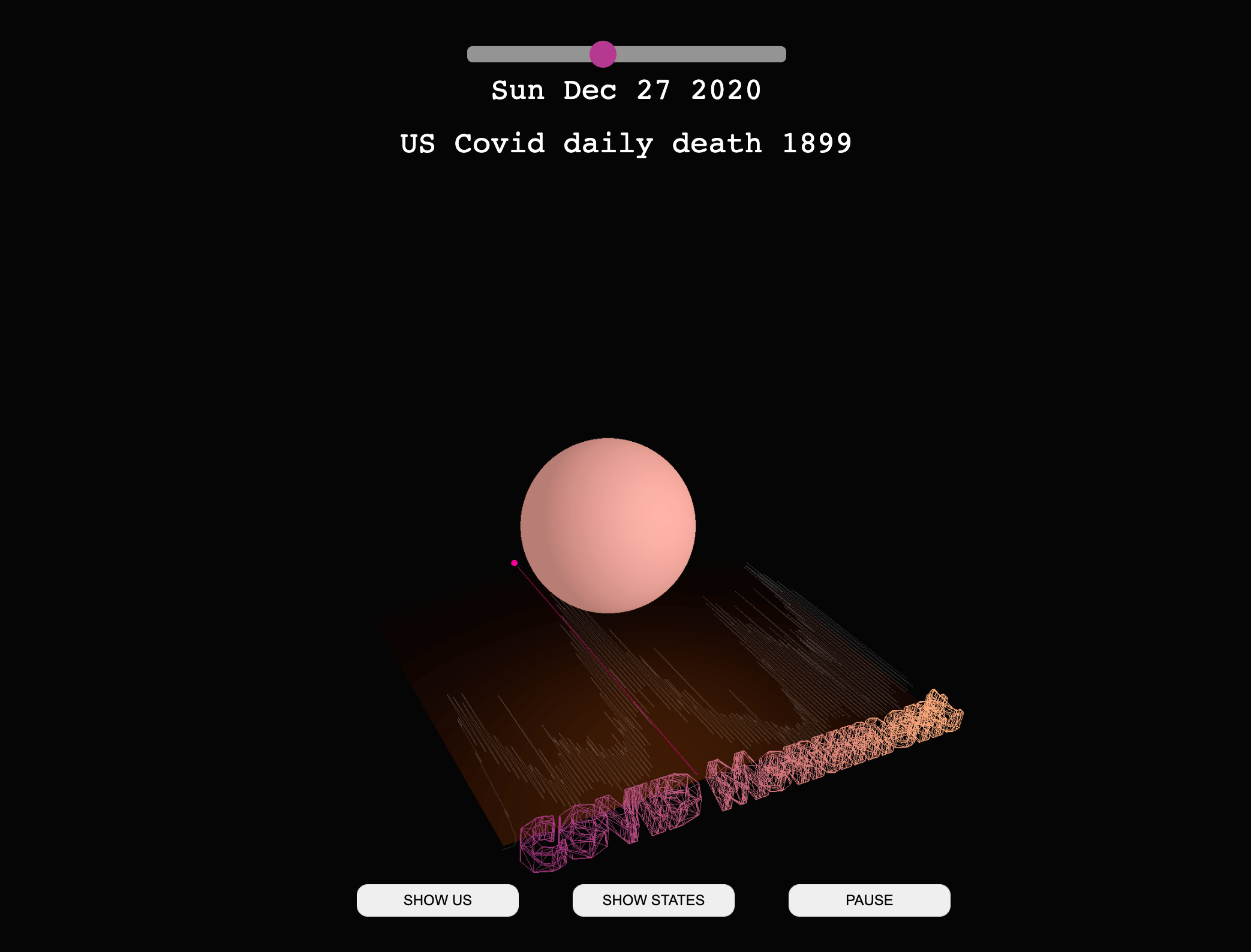
To demonstrate the human toll of COVID, students at ID created a visualization of data from the CDC. This data visualization ultimately serves as a monument that reminds viewers that the people lost to COVID are more than numbers. It helps us to recognize this extraordinary human loss. From the beginning of the pandemic (February 25, 2020) until February 25, 2022, the US death toll was 946,686.
Covid Data Visualization
This animation can help people understand how COVID changed through time without requiring them to process the number in their heads. The moving bubbles represent lives, meanwhile, the merging effect expresses how humans should be united when facing such a crisis.
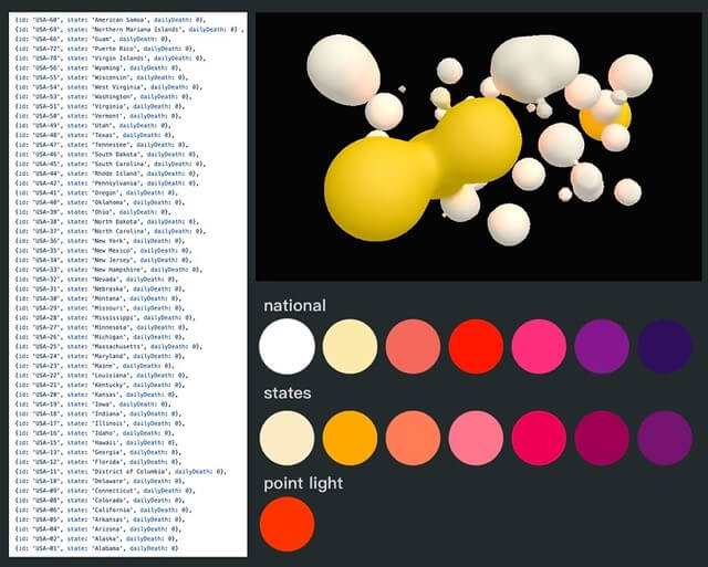
By using national data and each state’s daily death data, along with the overall line chart, the visualization allows viewers to understand the data points according to their own preferences. The macro level of the national bubble and the micro level of the states’ bubbles combine from different angles to view the connections.